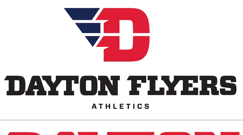
Dayton will phase out the old logo over the next couple of years. It was introduced in 1994 and simply featured “Dayton Flyers” with flags coming off the “N” in Dayton and the “R” in Flyers.
“We were literally one of the only schools in the country that had to give you our first and last name,” said Athletics Director Tim Wabler. “We’re a dynamic institution with a bright future. What we need is an athletics logo that really supports that.”
The players were also seeing the logo for the first time. Sibert said he loved the new look.
“It’s good to actually have a logo,” he said. “That’s the first thing I saw. The ‘D ‘with the wings, it’s us.”
Judging by the reactions on social media, that opinion isn’t widely shared. An overwhelming majority of fans expressed their disappointment on the Dayton men’s basketball team’s Facebook page or elsewhere. Most fans did seem to like the uniform redesign featuring the “D” logo on the shorts and the word “Dayton” across the chest in the Vitesse font.
“A logo change was long overdue,” said Matt Hager, a 2004 UD grad who lives in Columbus. “The old look was dated from pretty much the time it was unveiled in the 1990s. The (new) logo is a missed opportunity. It’s better than the previous but still not great.”
Hager called the new uniforms the best UD has had in decades. Ron Driesen, a 2007 UD grad from Kettering and a season-ticket holder his whole life, also loves the uniforms. The logo didn’t impress him when he first saw it.
“I really wish they would have went in a different direction,” Driesen said. “It is growing on me though.”
The logo was designed by 160over90, the same agency that came up with the new Atlantic 10 logo. Nike also consulted on the logo. Darryl Cilli, the chief creative officers for 160over90, said the UD logo was inspired by pro sports team logos, aeronautic brands and the idea of Dayton being the birthplace of flight.
The Flyers themselves, coming off the most memorable season in 30 years, influenced the logo as well.
“The team played fast and fearless and was a high-flying team,” Cilli said. “The program ultimately needed an identity that was as good as the players, the coaches, the venue and the fans.”
Dayton’s run to the Elite Eight accelerated the process of designing the logo and releasing the finished product.
“Without that, it might have been a little bit longer, but this is just the ideal time really,” Wabler said. “We got a lot of attention last year. We’ll continue to get a lot of attention. We really want this brand out there, which is cleaner, more progressive. It fits more media than our wordmark did.”
The women’s soccer team will be the only fall sports team wearing the new logo on its uniforms. That’s a matter of timing as much as anything because many of the teams didn’t have time to order new uniforms this close to the season. The men’s and women’s basketball teams will have new uniforms with the new logo when the season starts in November.
“One of the things in this day and age is a unified approach to the branding of who we are as a university,” Dayton men’s basketball coach Archie Miller said. “In our field, whether you’re the Pittsburgh Steelers or Duke or Arizona or Ohio State, there’s that one thing that everyone identifies with. I’m not sure nationally we had that (identity). We talked a lot about that over the course of a couple years.”
About the Author

